

Written by CadmiumCD Contributor, Pamela Shigeoka
Here at CadmiumCD, we’re always working to improve our clients’ experiences with our products. Let’s take a look at what’s new.
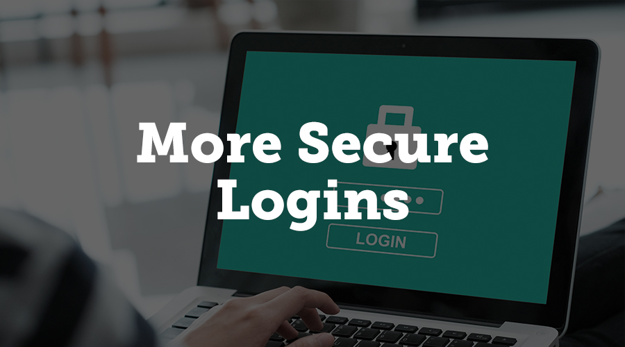
More Secure Logins
If you’re an event planner who works with multiple clients who use CadmiumCD’s products, you will be able to unify your logins with a single password. You’ll just indicate which client’s dashboard you’re logging into and enter that single password. We hope this will be much more convenient than having to save multiple passwords for each of your clients.
We have also made adjustments to the myCadmium login system that will help keep your account more secure. New passwords must have a minimum length of 8 characters and include 1 special character, 1 uppercase character, and 1 lowercase character. You will be required to change your password every 120 days, and passwords cannot be changed more than once every 24 hours. You will not be able to have your password emailed to you anymore; instead, you can click a reset link and will be sent an email that lets you create a new password.
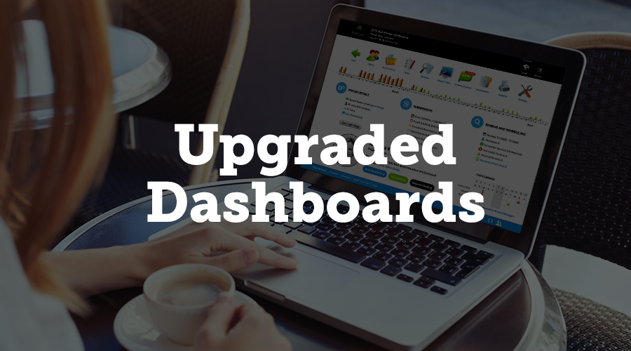
Upgraded myCadmium Dashboards
You may have noticed that we’ve been introducing upgrades to the dashboards for a number of our products. In March, we’ve extended those enhancements to Education Harvester, Expo Harvester, Survey Magnet, and the eventScribe mobile app dashboards. You’ll be able to see your project manager’s contact information, their schedule, and your boomerang tools from the dashboards of all these products.
With the enhanced dashboard, you’ll be able to see more schedule information to help you schedule calls or meetings. You can see the schedules for your project manager and account rep, if they are different. When you mouse over the schedule, tips pop up to explain what each dot represents, such as company wide events, days off, modified schedules, and so on. The link under the calendar takes you to the schedules for all other project managers, so you can find someone to answer your question when you need it answered.
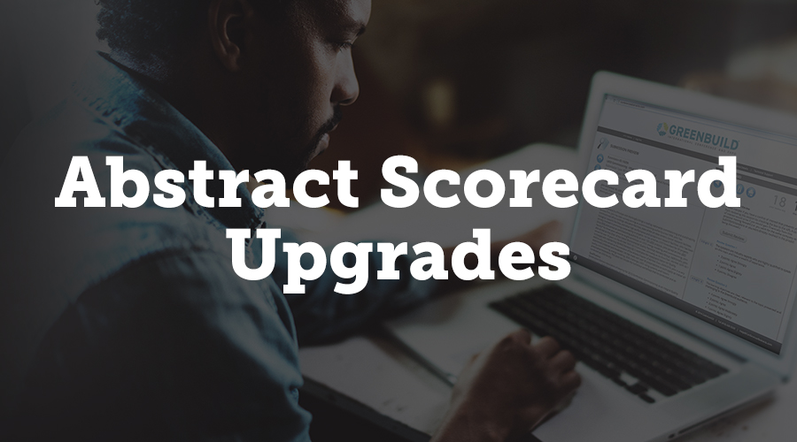
Abstract Scorecard Upgrades
We made a lot of changes to Abstract Scorecard, making it easier for you and your attendees to use. Specifically, we’ve done a lot to make learning to use Abstract Scorecard much more convenient.
When you mouse over your Scorecard link, you will now see the Abstract Scorecard handbook alongside your project manager’s information. The handbook is a 110 page, downloadable PDF, which gives you an easy-to-access reference for the basics of how to use Abstract Scorecard. You can also find the handbook in the training section of myCadmium. This is the first product handbook we’ve launched, but we are planning to launch handbooks for our other products over the course of this year.
In the Abstract Scorecard User Guide, we’ve added two new PDFs to help you learn how to use the product: Building the Submission Site and Testing the Submission Site. This information is in the larger handbook, but the shorter PDFs function as quick references if you need a refresher on how to do something in particular. The User Guide also contains step by step guides with helpful images and tooltips to explain what specific CadmiumCD terminology means. And we’ve also added a lot of training videos for the Abstract Scorecard. The short videos can help advanced users learn or refresh their memory without having to sit through the more exhaustive, hour-long training videos.
We’ve also made two changes to Abstract Scorecard outside of training purposes. In late March, you will be able to add Google Translate to your Scorecard. This will allow submitters to change the language on your Scorecard pages via a drop down menu. It’s a smart system that knows what to translate and what to leave alone, so proper names, company names, and acronyms will be left alone with the relevant text will be translated. Google Translate will be available for both standard and pro Abstract Scorecards.
And finally, we’ve enhanced our calendar report. Our clients needed a more detailed look at how the numbers of active, withdrawn, and complete submissions had changed over the course of their submission period. We’ve made modifications to the calendar so you can get more information about each individual day. On your timeline, you will now be able to see a line for submissions added to the system as well as how many were completed, and a count of number of active submissions that existed on that day. You can also get a report with the same data all on one page, as the Calendar Report on your reports page. The reverse chronological spreadsheet shows exhaustive data about submissions.
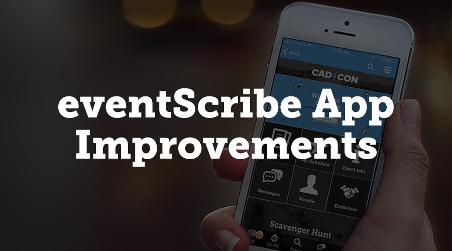
eventScribe App Improvements
We added a few enhancements to the eventScribe mobile app to help you better process your event’s data. We’ve actually designed a brand new page for visualizing your schedule data. When you click on the schedule page, it’s much more streamlined, with one row per presentation, organized by the conference, and the page loads much more quickly. When you click on a row, you see the presentation information plus a thumbnail of the first slide alongside a note about how many slides are available. The new page will even show a preview of what the menu buttons will look like for that presentation in the mobile app.
The schedule page also now indicates number of updated slides in any given presentation. The original number and the updated number both appear on the presentation page so you can see how many slides have been added since the presentation was created.
You can now visualize your attendees’ note taking habits. Using same charting technology as we do in the app stats package, you can see a graph showing how many notes and drawings attendees did per slide for any given presentation. This allows you to see how much engagement you get from attendees.
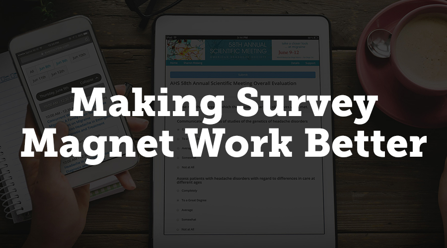
Survey Magnet Enhancements
Survey Magnet is our product that allows you to create surveys or quizzes, and is commonly used for session evaluations in many events. We’ve made many improvements to Survey Magnet.
We introduced new assessment settings for reports in February of this year. This is particularly useful for session evaluations, since it lets you more closely control what data is shown to speakers. The new options include the ability to show speaker names under presentation titles, to show speaker names next to the results, to show attendee names next to comments about the presentation, to show average Likert score, to show average Likert score for speakers, and to show total speaker score for Likert questions. These settings allow you to tune your reports based on your needs.
We’ve also added an automatic feature that locks assessment settings automatically once attendee data starts coming on. Some clients have had problems in the past with editing assessment settings for evaluations during their event. This can cause big issues with your data reports, since some results could come in under one format and the rest under another. If attendee data is starting to come in, the assessments are automatically locked. You can choose to unlock it if you want to, but to prevent accidental changes or question types being changed mid-session, it locks automatically. It is easy to unlock, in case you need to make a quick change like fixing a typo; simply click the lock icon on your assessment list.
You can now use test accounts with Survey Magnet. Test accounts have same privileges as regular account but data from test accounts does not affect final reports and results. On the users page, simply click the icon in the Test Account column to convert that account to a test account.
Survey Magnet now supports up to 30 credit types, up from 15. Each of the blocks in your schedule can be assigned a different number of credits for each credit type. The tools page that shows blocks still shows only 15, but when you go to edit, you can choose up to 30. All credit types are respected in Magnet settings and in reporting and certificates.
We’ve also added an option that lets attendees view and print the results of the quizzes they pass. There’s a blue button now when an attendee passes a quiz that allows them to view the results: type of question, result, their response, and their response time. They can also print responses or save as a PDF. At the top of page, you’ll see your score and the average user score.
Survey Magnet now has a new feature that is great for large, complex conferences. A presentation can have an unlock code, and that presentation’s evaluations cannot be completed unless the attendee has the code for that presentation in their registration package. This allows you to limit access to evaluations to people who’ve paid to attend those sessions. Their email address and badge number functions as an unlock code, so they don’t have to enter anything else; the codes are linked to their accounts. Blocks without a code associated are open to everyone, and blocks with a code can be set to be shown to everyone but inaccessible if they don’t have a code or invisible to anyone without a code.
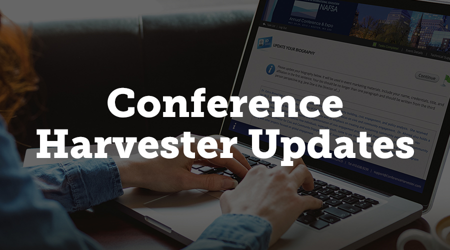
Conference Harvester Updates
Conference Harvester has also been updated with a lot of new features that will make managing your data easier on you. We’ve created a multi-select tool for presentation icons that let you put icons next to presentations on website or mobile app. You can control size of icons, what the icons look like, and what the the tooltip associated with that icon says. You can also add new icons, upload your own icons, give them a tool tip, and even associate a URL with each icon. The icon list has drag handles that allow you to put icons in whatever order makes sense to you.
Another new feature is the ability to use the checkbox column to select multiple presentations at once and assign an icon to all. You can, for example, sort presentations by track, select all, and then apply the icon to selected icons. This makes the task of assigning icons to many presentations much easier.
We’ve also added the ability to put notes on your custom fields. If you need to use many custom fields, this is very helpful to help define those fields if the name itself isn’t enough to explain the field. The notes function as a good for reminder in a few months or even next year, when you go back to work on the next show. A good use would be for secondary instructions; for example, instead of using “Calculated Room Capacity (do not touch this!)” as the field title, you can add “Do not touch this!” in a note instead.

Making Our Products Work Better For You
We are constantly working on our products to make sure that you have the best features and the best experience with your event technology. We listen to our clients’ needs and requests and do our best to implement them across our product line. If you have questions about any of the new features discussed in this article, contact us directly.
About Pamela
I am a freelance writer who enjoys dipping my toes into a wide variety of writing subjects. I have an M.A. in English but found that teaching wasn’t for me, so I’m applying my training to writing instead. I’ve been blogging for ten years and have written everything from book reviews to pop culture essays to business topics. In my spare time, I enjoy writing fiction, playing games, and learning new crafts. I live in Corvallis, Oregon, with my husband, daughter, and dog.