3 Ways to Make Your Conference Website More Accessible
Updated November 13, 2023
Read Time: 1 min
by Michael Doane

Meghan Capiaghi and Amanda Weber recently shared how CadmiumCD’s Abstract Scorecard changes have made the product more accessible to users (watch the recording). We took all the great resources they mentioned and compiled them below.
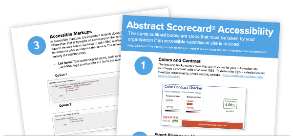
1. Create Contrast on Your Site
Colors are an important factor for accessibility. To be truly accessible to those with visual impairments, your site must have a contract ratio of at least 4.5:1.
2. Use Instructional Language
“Click this Button” makes no sense to someone who uses voice commands. Get creative with your language to reflect a wider audience. “Use this button” may be more appropriate.
3. Don’t Forget About PDFs
Do you share PDFs on your submission site? Any documents linked from your site must also meet accessibility standards outlined by the W3C’s WCAG 2.1 initiative.

Use the Form Below to Get Access to Accessibility Links & Resources
There are plenty of good resources around the web to help you with achieving the above and more. Use the form below to get instant access to a PDF we’ve put together with links to the best tools we’ve found.
Thanks for downloading the accessibility tips!
If the download does not begin automatically, download the file here


