8 New Features to Optimize Your Event Website Management
Written by CadmiumCD Contributor, Pamela Shigeoka.
CadmiumCD recently introduced a number of new features to the eventScribe® Website, all designed to make managing and editing websites easier for our clients. One of the most exciting changes we’ve made is to give our clients even more control over the content, color schemes, text, and labels on their event website. The tools to make these changes are available to website admins directly on the website, so you won’t need to switch back and forth between a dashboard and your site to see changes as you make them. Let’s take a look at all of the new tools and features, which will be available in every new eventScribe® build from now on.
Dashboard Optimization
The eventScribe dashboard is the first thing you see when you manage your event website, and we’ve taken steps to make it easier to use than ever. The dashboard is much more efficient now, with load times cut in half and unused menu items removed. We’ve also made tweaks to existing items such as the stats that are shown, and we’ve made the overall view more efficient.
As we’ve done in some of our other products, we’ve introduced a feature to eventScribe that shows your project manager directly on the dashboard. The project manager information box includes buttons to send a Boomerang directly to your project manager, to ask a question, or to request a meeting. Sending from your website dashboard does designate the Boomerang/question/meeting request as related to your website, so if you have a question about Harvester or any other product while in the website module, you would want to create that question or Boomerang directly on your Boomerangs page.
The team calendar is another new feature on the dashboard. It’s a great way to see your project manager’s availability. If they have a day off or an office event, you can see that they are unavailable at that time and try to schedule a meeting on another day. The team calendar provides an easy way to see if we’re in the office.
The new dashboard gives you direct access to our online users guide. We’ve added more content and will continue to do so. Because the users guide is so easy to access now, it’s an even more valuable resource to learn about the product or refresh your memory on how to do something in particular with your website. We hope this makes it easier for you to take care of tasks without having to send a Boomerang to us and wait for a response.
Finally, we’ve added helpful footer bar options to the dashboard. You can click icons that allow you to access Omni Search, access help tips and user guides specific to the page that you’re on, contact us, and access your Boomerangs page.
More Control with New Page Settings Options
With this new update, we’ve give you even more control over how certain pages on your website look. And for your convenience, the controls appear directly on your webpage if you’re logged in as an admin.
The options within the settings are dependent on which page you’re on. If you’re on the schedule, for instance, clicking page settings will give you a screen with tabs to edit the labels, appearance, navigation, and data that appears on that page. In the labels, you can change the name of the page title. The appearance tab lets you change the look of the page. You can change presentation alignment, change how sessions are grouped, and adjust title text colors, and so on. The navigation tab controls breadcrumb options, day tabs, and allows you to hide or show the left side navigation. The data tab controls how data will show on that page through build code and Harvester data features. Be sure to click save settings button on each tab before navigating to another tab to save your changes.
If you’re unsure what a particular settings feature does, we’ve made finding out easy, too. Next to each option in the settings page is a question mark icon. Click the question mark and get help tips about that option.
Add Google Translate To Your Site
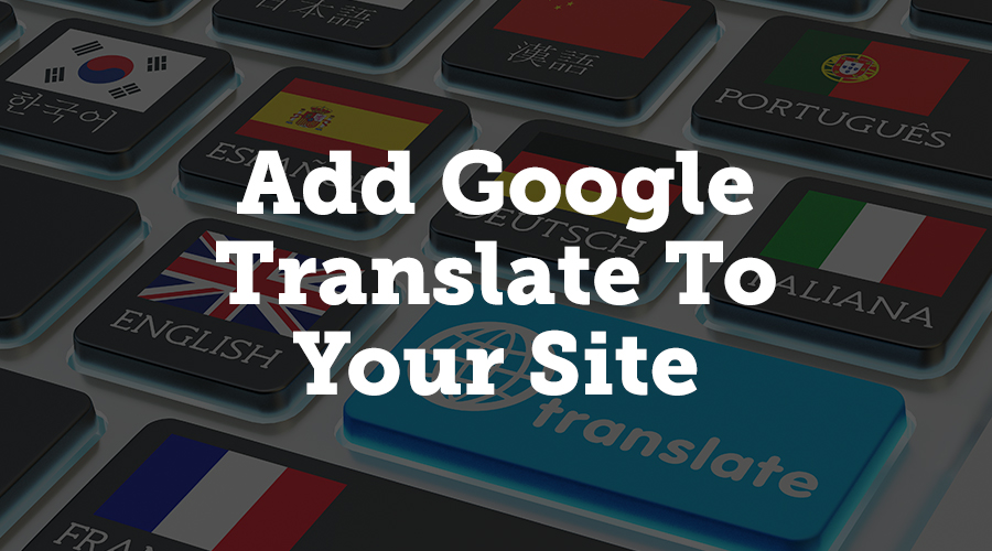
If you have international attendees, you now have an option to add a Google Translate widget to your site. If you enable the widget, site visitors can choose from a number of languages, and Google Translate will automatically render your menu options, site text, and your header/footer links into that language.
To enable this, simply go to the Navigation tab on your website module, click the General tab, and then change the setting to Yes on Show Google Translate. Then save your changes, and your site visitors will see translation options.
Quick View with Settings Summary
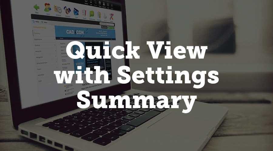
We’ve added a summary tab when you first open the Settings menu in your website module. This summary gives you a visual preview of what your website looks like, so you can see a snapshot of your website without having to open another browser tab.
Improved Expo Views
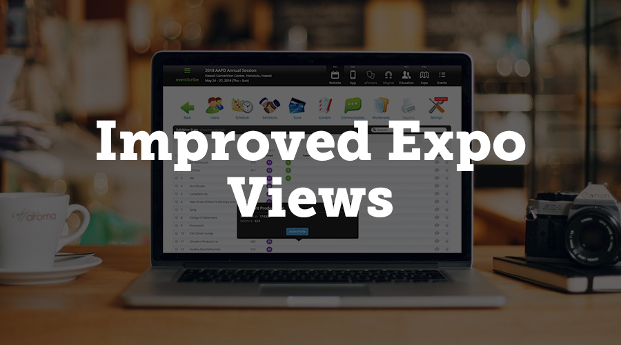
There’s a new Tools page in the website module that displays enhanced exhibitor stats. You can quickly see views, likes, and tweets for each exhibitor’s booth, and a pop up on each row links to the exhibitor’s profile page. This new page gives you a cleaner look at the views and likes your exhibitors are getting.
New Print Option for Attendees
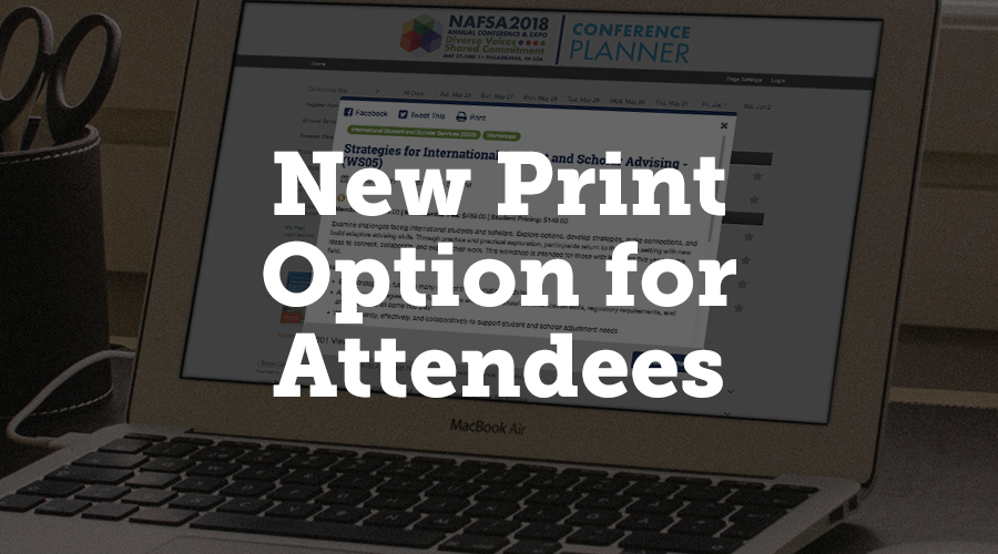
Your website can now give attendees the option to print information about a presentation. In the navigation tab on the settings page, click the popup subtab, and choose “yes” under Show Print Button. The print button will appear in top bar of the presentation popup. When attendees click this button, it will open a page formatted for printing.
Embed eventScribe Pages on Your Organization’s Website
We’ve added a new option that allows you to embed three eventScribe pages on your organization’s non-eventScribe website. You can show your schedule page, speaker list, and booth list on your own website, so visitors can get a quick look at your event information.
You will need your own IT person to embed the pages, and there are some limitations as to search options. But you can embed these pages either as a full page or as a section within one of your existing pages. All eventScribe embeddable pages are PCI compliant and mobile responsive.
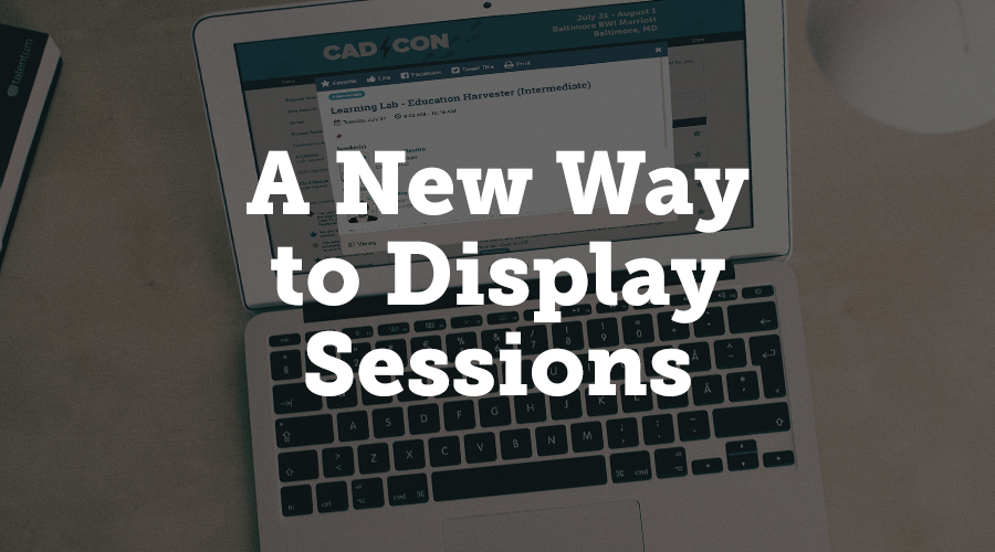
A New Way to Display Sessions
If your event is heavily session-based, we’ve added an alternate way to display your session data. When a user clicks the session name in the new view, the presentations will appear inside a pop up, making it easier for them to see each session at a glance. You can choose between the classic view or the new view.
Conclusion
At CadmiumCD, we are continually working to improve our products, and we value our clients’ suggestions and requests. We hope that these improvements to eventScribe help make managing your event website a more streamlined process. If you have any questions or comments about these new features, please contact us to request a demo.
About Pamela
I am a freelance writer who enjoys dipping my toes into a wide variety of writing subjects. I have an M.A. in English but found that teaching wasn’t for me, so I’m applying my training to writing instead. I’ve been blogging for ten years and have written everything from book reviews to pop culture essays to business topics. In my spare time, I enjoy writing fiction, playing games, and learning new crafts. I live in Corvallis, Oregon, with my husband, daughter, and dog.