

Written by Sara McGuire, Content Editor at Venngage.
After pouring time and resources into developing an app for your event, it would be disappointing if it didn’t catch on like you hoped.
In most cases, attendees don’t use an event app for one of two reasons:
- The app offers a bad user experience.
- They didn’t know the app existed.
If you’re leading up to a big event like a conference, your attendees are probably receiving multiple emails with reminders, itineraries, and more. It’s easy for pieces of information to slip through the cracks.
That’s where a marketing poster for your event app can come in handy. You can share your poster on your event page and pin it up around the event venue. A poster can grab your audience’s attention and communicate the value of your app quickly, in one page.
Here’s how you can create a poster for your event app in 5 steps.
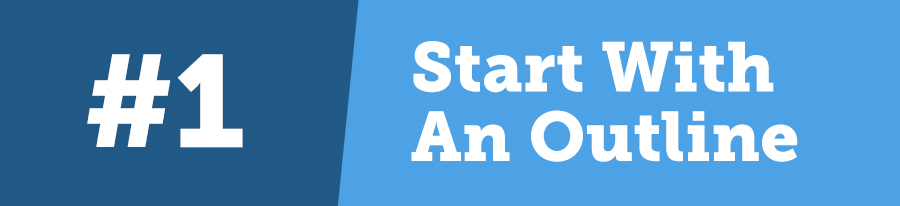
1. Start with an outline of your poster
Before you dive into designing your marketing poster, it’s a good idea to have a plan.
Draft your poster copy first. What information do attendees need to know?
Generally, you should include:
- An attention-grabbing header (ex. “Don’t miss out on any of the fun!”)
- Brief instruction for how to download the app
- Key features of the app
Usually, that’s all you need. Try not to overburden your poster with text, as that can lead to a cluttered design.
Once you’ve drafted your text, then you can start thinking about the design.
The goal of your poster should be to grab the attention of attendees and to deliver the information about your app in a concise and compelling way.
If you’re working within a design budget, or if you’re stuck on a concept for your design, it can be helpful to start with some examples. There are poster makers out there that offer poster templates that you can use as a jumping point for your design.
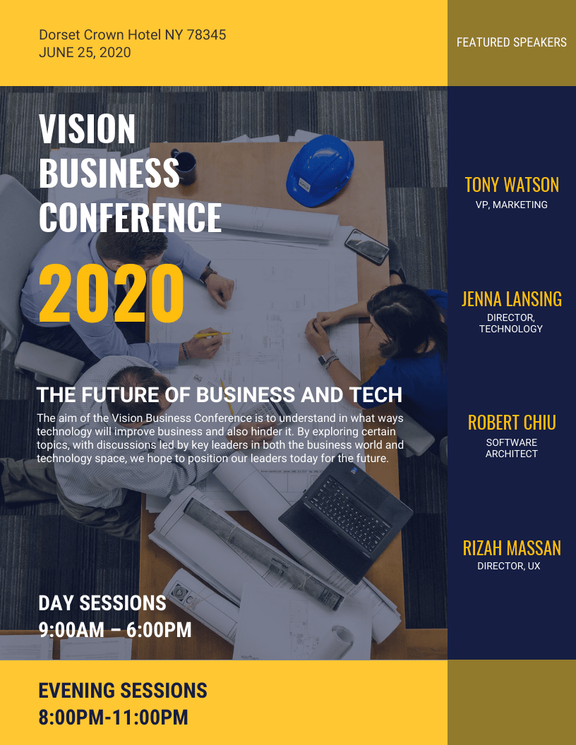
Looking at a few poster examples will also help you figure out what kind of layout you want to use for your poster. Do you want to do a more classic top-to-bottom poster, like this one:
Or a more unconventional circle layout, like in this poster:
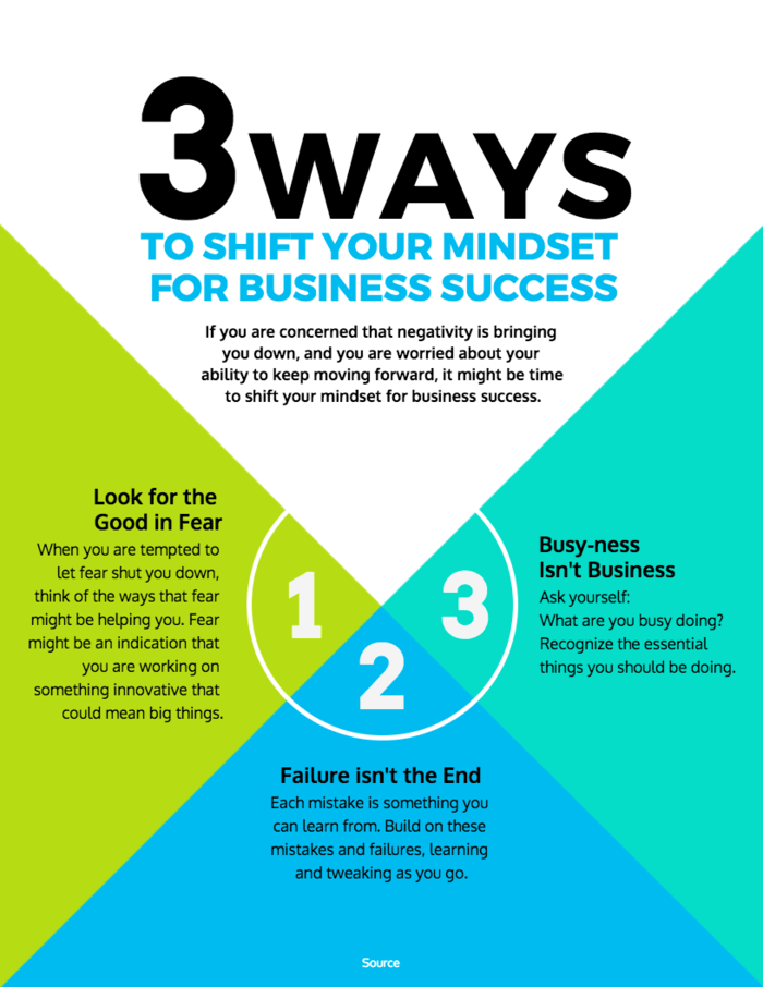
An unconventional layout could potentially be more eye-catching. Just make sure that the information is still easy to understand.
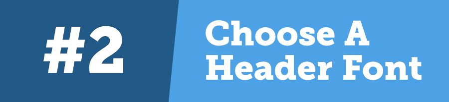
2. Pick a header font that reflects the tone of your event
Font psychology affects our perception of fonts. Each font has its own “personality” and cultural associations.
Think about how your font choices affect the branding of your event – do you want your app to seem fun and casual? Innovative and futuristic?
The fonts you choose can affect the mood or tone your poster conveys.
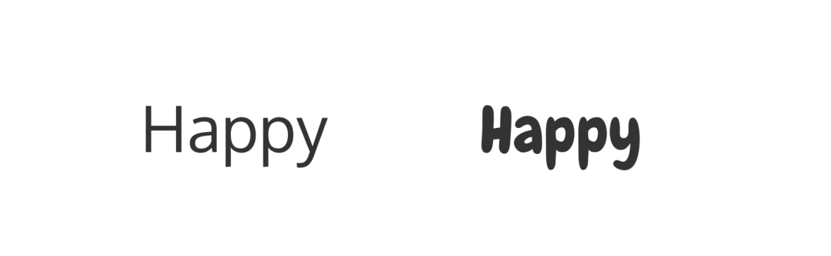
For example, which font looks happier?
Now which font looks more confident?
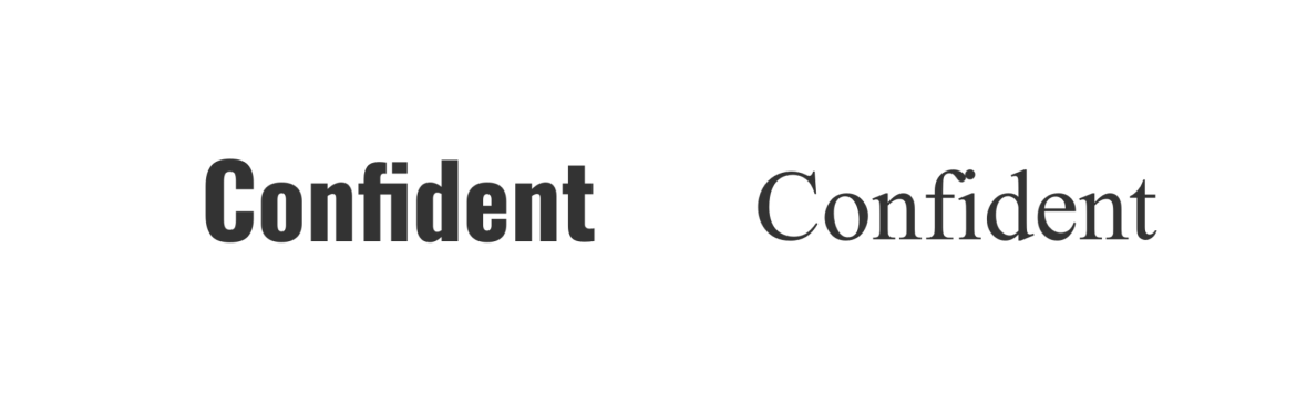
See what I mean?
As a rule of thumb, use no more than three different fonts in one poster. Pick a bold, decorative font for the poster header. Then, pick a more simplistic font for the sub-headers and body text.
3. Use colors to highlight key information
When it comes to poster design, your color selection should be about more than just looking pretty. The colors should also help attract attention and direct how your poster is read.
Use one bright, contrasting color to make specific works pop.
Bold colors will also stand out more from a bulletin board or a page on your site.
Another design rule of thumb: use dark text on a light background color, and use light text on a dark background color. Otherwise, your text will be hard to read.
4. Incorporate eye-catching images
The images you use in your poster should support the text by illustrating concepts and emphasizing important points.
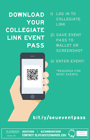
For example, you could incorporate a picture of a phone to indicate to people upon first glance that the poster is advertising a mobile app, like in this poster example:
Icons are another great way to enhance your poster design.
Certain text can be replaced by icons, as long as the meaning is widely known. For example, icons for different social media platforms are immediately recognizable to most people.
You also can put icons beside important points to draw attention to them. Put icons beside headers, or beside important steps you don’t want attendees to miss.
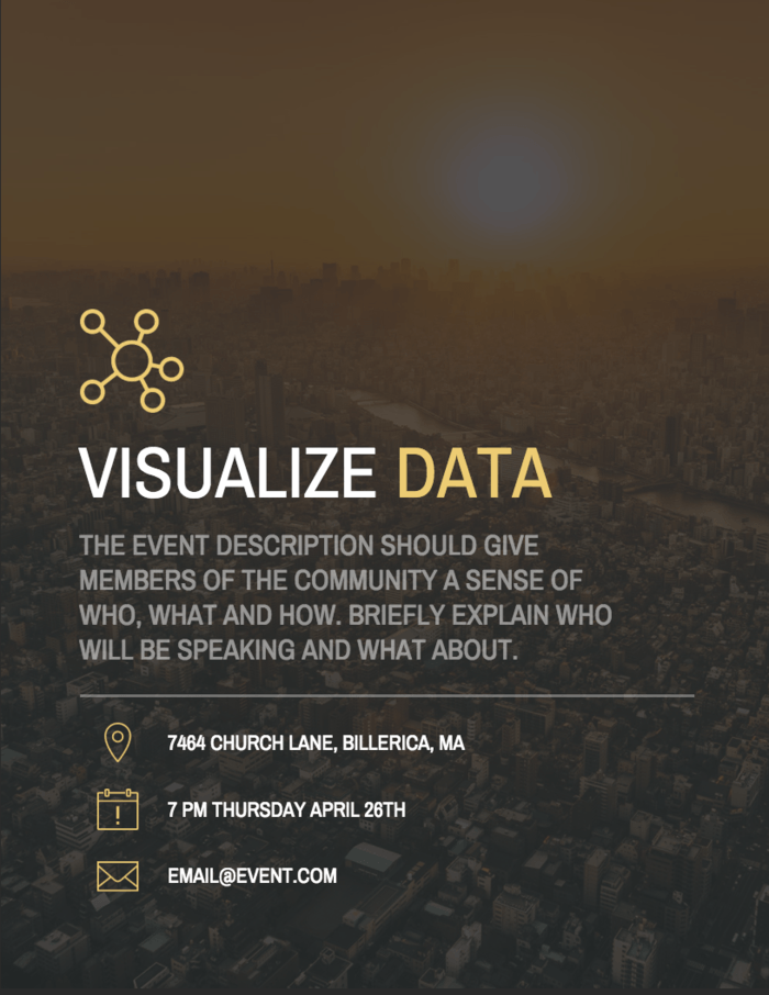
For example, look at how icons are used to draw attention to the event details in this poster:
5. Optimize your poster for its intended platform
Think about where you will be sharing your poster. Are you planning on just sharing it online? Or are you planning on posting it around your event venue?
Make sure that your poster is properly optimized for the platform it will be shared on. For example,
Optimizing your poster for social media
You’ll probably want to share your poster with your audience on social media. In that case, you may want to tweak your poster dimensions depending on the platform.
Currently, the recommended image dimensions for social media are:
Facebook: 1,200 x 630
Twitter: 440 x 220
Instagram: 1080 x 1080
You can also post a thumbnail version of your poster and then link to the full poster on your site. Just make sure that the thumbnail still makes the message clear.
Optimizing your poster for print
If you’re planning on printing your poster and pinning it up on a wall, there are a few things you need to keep in mind.
The header text should be big enough that passers-by could read it from a few steps away. Sizing your font at around 150 – 200 points would be a safe bet.
Also make sure you export your poster image in high resolution. Export at around 300 dpi so that the image won’t come out blurry when printed.
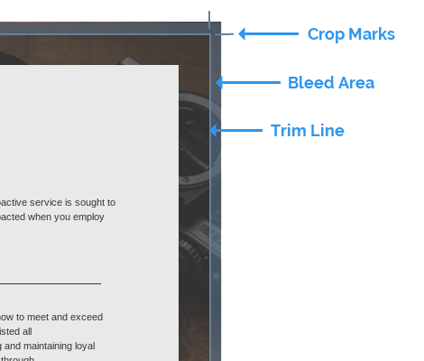
If you’re having your posters printed professionally, you should also set bleed marks. “Bleed” is a printing term for the areas around the outer edges of your poster that will be chopped off after printing.
If your poster has a solid background color, or if images touch the border of the page, setting bleed marks will indicate where the edge of your poster are.
Conclusion
Now you’re equipped with the basics for creating your own marketing poster. Remember, the primary goal of your poster should be to grab people’s attention and let them know about your app as clearly as possible.
When in doubt, it’s always helpful to start with a marketing poster template. Then, look for ways to incorporate your brand’s personal flare.
So what are you waiting for? Get the word out there about your awesome event app!
About Sara

Sara McGuire is a Content Editor at Venngage, an online graphic design software. She loves writing visually engaging, data-driven content. Check out Venngage’s blog for more design guides and visual content marketing tips.