Virtual Expo Booths, Match-Making, and Attendee Engagement: 10+ New Features for Your Virtual Events
Written by CadmiumCD Product Manager, Dani Zieren
As for many of you, this was our first year organizing a virtual event. Our annual user group CadCon took place online in 2020. This keynote was shared with attendees through our live stream platform and we had a lot of new virtual features to share.
Virtual Expo
Improvements to Virtual Booths and the Product Showcase
Under the add-ons page in the Expo Harvester we have a new Virtual Expo tile that automatically becomes available when you upgrade to the virtual booth add-on to enhance the booths popup on the website.
It brings you to a page that lists out all of your virtual booths and shows which options have been activated for each booth, so you can see this at a glance. It has columns for badges, booth banners, giveaway buttons, Video Chats, introduction videos, Scavenger Hunt participation and lead retrieval. Use the Booth Preview button to see the virtual booth as it would look to attendees on the website. Exhibitors can also preview their booth when they login to their Expo Harvester dashboard.
To drive more traffic to the virtual booth, exhibitors can add a giveaway button that will show at the bottom of the popup. The button links to a page that the exhibitor provides with a form for the attendee to enter the giveaway.
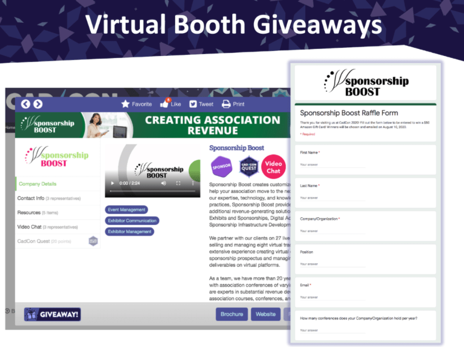
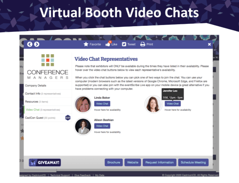
We’ve added more settings to control the details of virtual booths, such as whether the Video Chat tab will show for companies that don’t offer Video Chats and the option to add customized instructions at the top of the Video Chat tab.
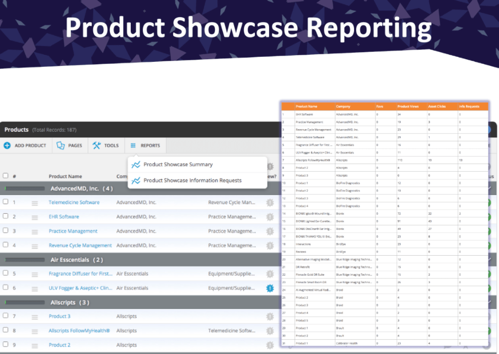
On the Product Showcase tab you can now show the hero image in front of the product title, to make them more attractive for attendees to click on and discover more.
Other updates on the Product Showcase include a report button on the Product Showcase page in the Expo Harvester to easily get to the Product Showcase Summary report and a report that shows all the Product Showcase Information Requests.
Here are two examples of virtual events that made creative use of the floor plan instead of just showing exhibitors in a linear list. Their designers created a background for the floor plan that fit with their event theme and that was uploaded to the floor plan to place the booths on.
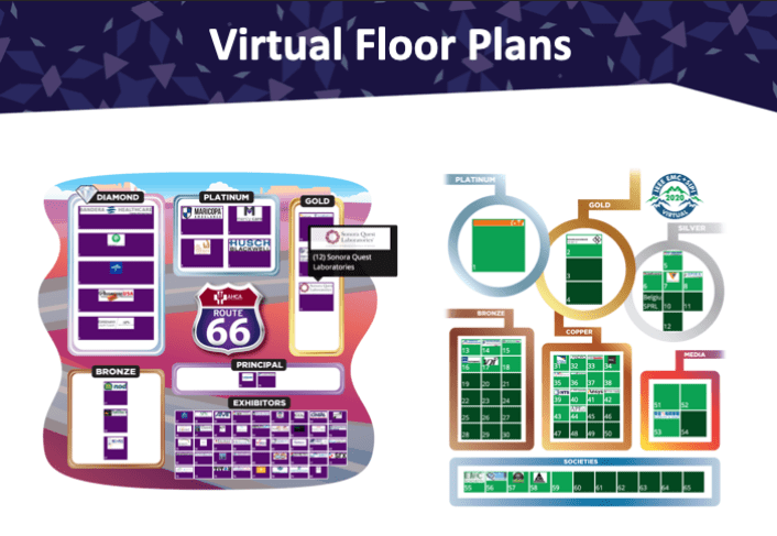
Another way for attendees to easily find booths they want to visit in a virtual expo environment with a large number of booths is the Logo Wall. This makes it easy for them to recognize logos for exhibitors they already know and visit their virtual booth. The search also allows attendees to find exhibitors they are not familiar with yet but that fit with their interests. You can control the way the logos are sorted, this can be based off of sponsor level but you also have the option to randomize the order so it’s different every time you refresh the page.
Matchmaking & Engagement
The New Profile Editor and a Preview of the Match Making Add-On
For virtual events, having an attendee profile with a lot of information is more important than ever. You control which fields are required for your attendees when they’re filling out their profile information
For example, you can choose whether a photo is required in a user profile. This is recommended when using features such as live streams with ARS or video chats, because having a face next to a name can help make feel attendees feel more connected with each other.
Digital ribbons for user profiles were launched at CadCon, this feature comes with Pro websites. Attendees can pick ribbons that they want to display on their user profile. You can design your own ribbons, but we have a template and pre-made ribbons available for you to use.
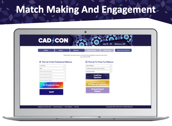
You can manage your ribbons from the ribbons page that can be found under the pages buttons on the users list in the website. You can assign attributes to each ribbon, like whether it’s a fun or a professional ribbon, whether there’s a maximum number of users that can have it on their profile, and have ribbons that are only available for user that have reached a certain number of Scavenger Hunt points. The page shows how many users have selected each ribbon.
Match making is a paid for add-on that we’re developing. The match making tab in the new profile editor automatically pulls in all the educational tracks and exhibitor categories, so attendees can put their match making points towards the ones that interest them the most. The example below shows you can put a weighted preference on these tracks and categories, by putting 1 point towards one that you are somewhat interested in but 4 points on something that is very interesting to you.
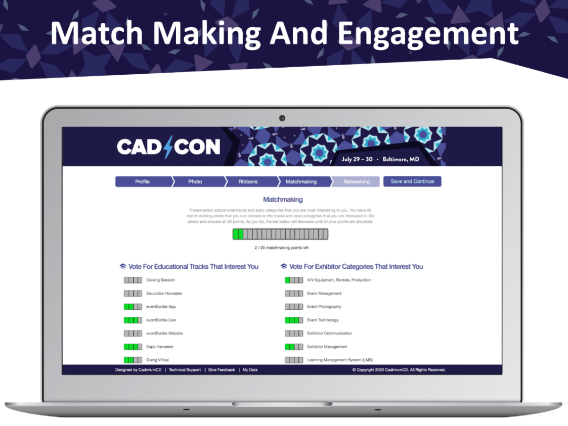
There is also a simpler way to do match making without a weighted preference, where attendees checkbox select the tracks and categories they like.
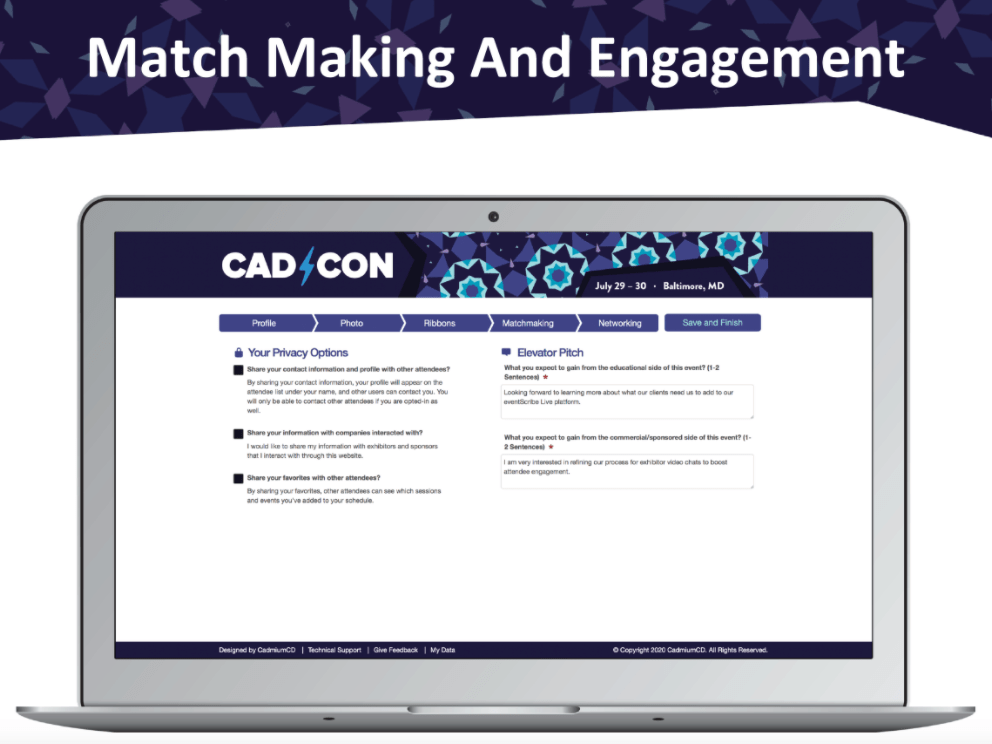
The networking tab in the profile editor allows attendees to choose their preferences in how they want to share their information. There is also an area for the elevator pitch that you can choose to activate with a pro level website already if you would like to give attendees the option to explain their educational and business reasons for attending the conference. This information will be displayed on the user profile and can be a good indicator for attendees and exhibitors if they’re a good match. It can also be very helpful for you as an event organizer to know what your audience is looking for in your event.
When collecting information on attendees’ interests in exhibitor categories using match making, the browse by company page can show attendees a percentage of how well they match with companies based on these preferences and allows them to sort by the closest match.
To set up match making we have designed a mission to make some basic choices about how you would like to set up match making.
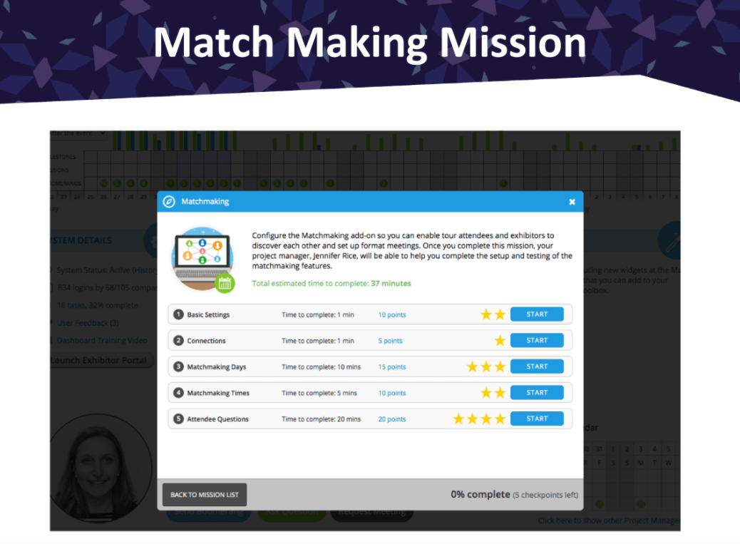
When match making is turned on, exhibitors also get a match making section in their dashboard when they log into the Expo Harvester that shows scheduled attendee meetings and pending meetings.
The attendee list shows their matches and allows the exhibitor to view the attendee profiles of their matches. There are several ways to filter the list to find good matches.
The attendee profile shows all the regular information and booth engagement so the exhibitor can get a better understanding of what their match is interested in and whether they want to send a meeting request.
You would also be able to see any scheduled and pending meetings from here.
The virtual booth summary report has a new column for meetings that shows the number of meetings for each exhibitor.
eventScribe Live Add-Ons
New Add-Ons to Consider and Refinements to the Ones You’re Already Using
When events started going virtual, many already had an eventScribe website and we started offering a number of new add-ons that could be added to the websites for virtual events.
We’ve created the eventScribe Live Player, which is used for livestreams as well as prerecorded MP4 videos of presentations. If you’re using an external company for professional closed captioning of videos, these .VTT files can be added to the MP4 player.
We will be continually improving the eventScribe Live Player over the next few months. The header at the top has been updated with more functionality, like the speaker popup that you see here. The ARS discussion area now supports emojis to make communicating in the livestreams more fun.
Auto-publishing is one of the biggest projects we have released on in the beginning of the year, that allows for presentations, posters and handouts to be automatically published to eventScribe. Our plan was to roll this out gradually during the summer, but we ended up activating it for all of our virtual events to make sure content uploaded by speakers automatically becomes available in the website and app.
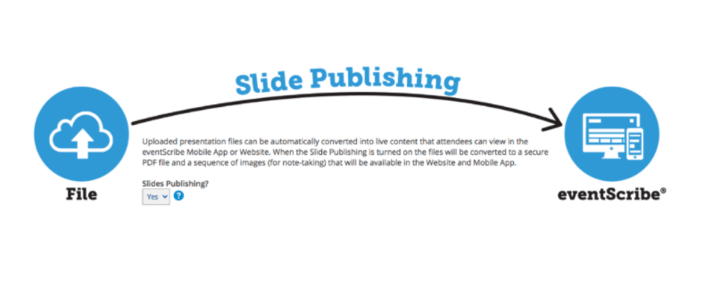
When slides or poster presentation are auto-published this also allows speakers to record audio on them, this audio task is included with pro level Harvesters.
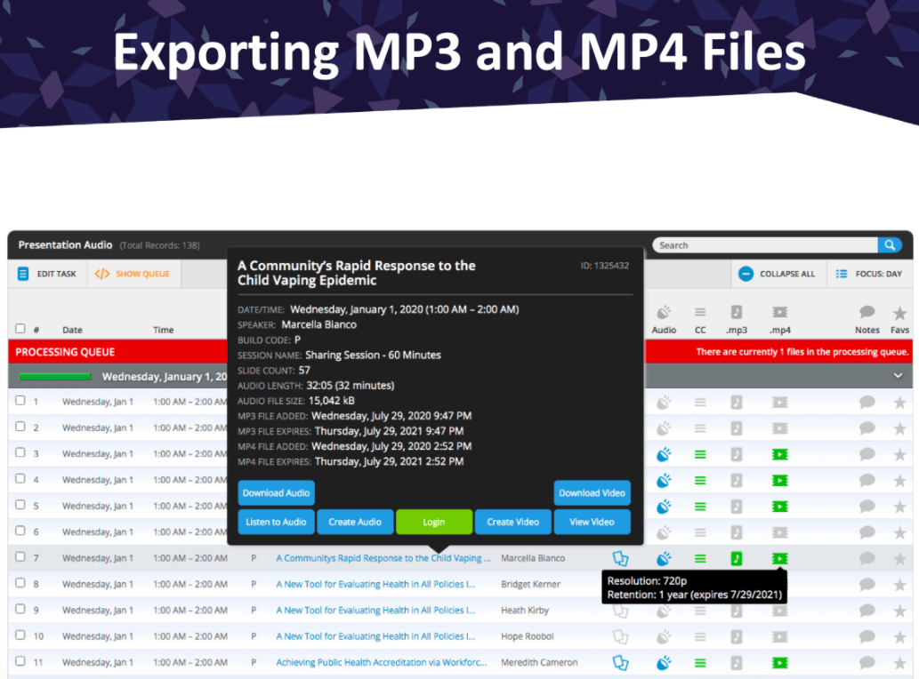
We have also added tools for you to export that recorded audio as an MP3 or as an MP4 where the audio is synched up with the slide that it was recorded on in case want to keep these files in your own LMS.
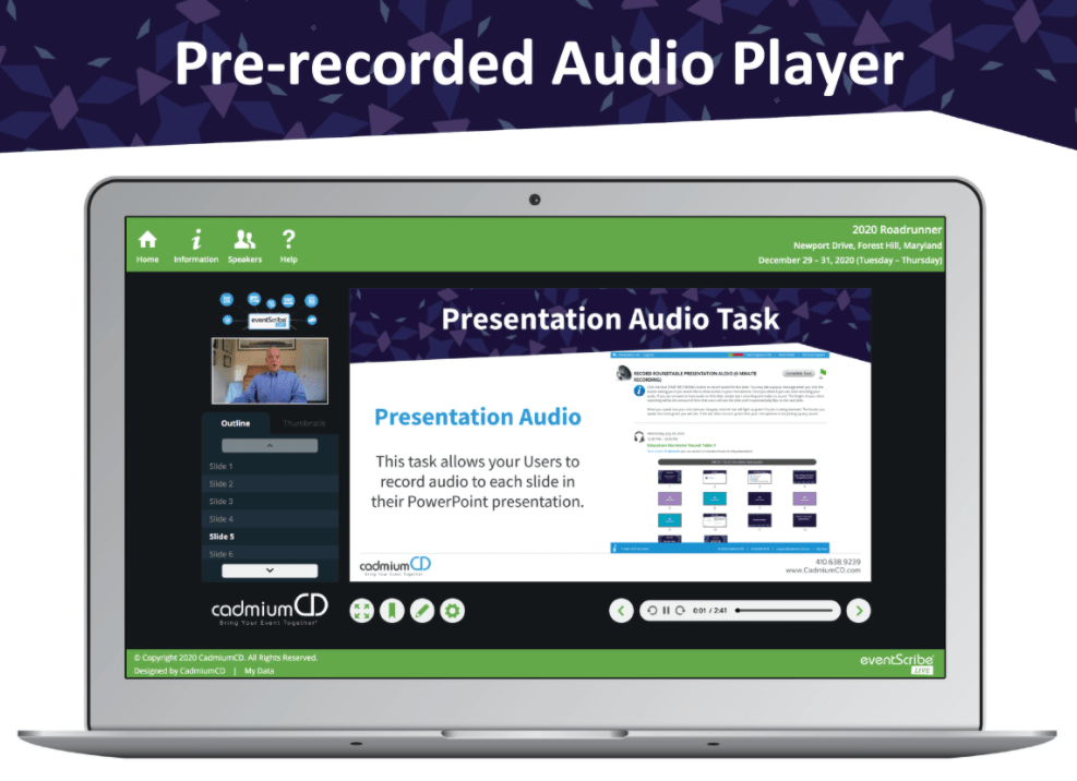
Our new slides + audio player has been updated with a more modern look, a dark and light mode, different ways to navigate through slides and an option to show automatically generated closed caption options. The closed captioning is a new add-on that we can offer that creates captions from the recorded audio on the audio task.
We have also been working on a Presentation Video Task that allows speakers to record themselves as they’re talking over the task, this hasn’t officially been launched yet but we’re looking forward to making this available soon. Another addition to the slides + audio task is that we can show a presentation specific banner in the player, which shows to the left of the slide.
The slides + audio player can also be used on mobile devices. This will move around the controls slightly so that it’s a better experience for mobile users, but it supports all of the same features as the desktop version.
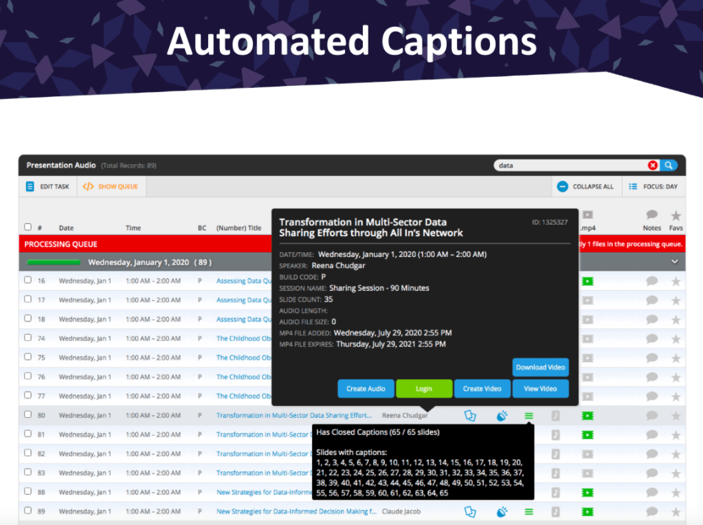
If automated captions are turned on, you will be able to see this on the audio task report in the Education Harvester. Hovering the captions icon on a presentation will show you which of its slides have captions.
The Audience Response System (ARS in short) will have a section in the Education Harvester for speakers when the Q&A is active for one of their presentations. It shows them how many questions came in and. how many of those questions haven’t been answered yet. The speaker can click on this presentation to go into the Q&A moderator screen and answer questions from there.
Video chats infrastructure on the server side has been set up so that we can support intensive use for virtual events. We have 18 servers in the different places around the world with an infrastructure behind it that points each individual to the server that will work the fastest for them based on a number of factors such as their location.
The eventScribe App has proven to be a great addition to virtual events as a second screen for attendees, for example by using ARS on their phone while watching the livestream on fullscreen on their desktop.
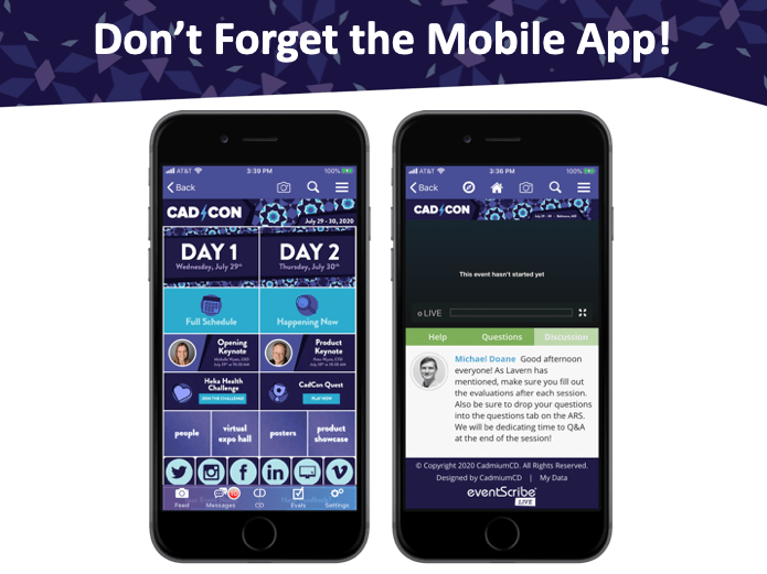
The mobile app is also a good way for virtual attendees to view content, it can play presentation and poster audio just like the website can.
The Activity Feed is a nice feature to add a fun social element to your virtual events.
Some other app features are viewing slides, looking up speaker information and participating in the Scavenger Hunt.
During virtual events it can be difficult to get the attendee’s attention the same way you would be able to if they were physically at your event, but by sending push notifications to keep them up to date about important virtual event information such as reminders of keynote presentations starting.
Coming Soon – Q3 2020
An Early Preview of Technology We’re Developing
In the event list in myCadmium you can now see your Website logins under the System button.
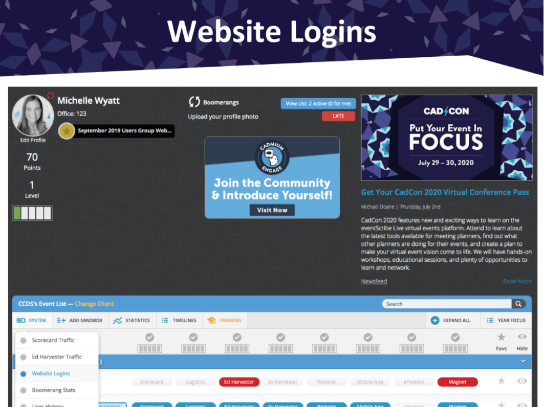
It shows you during which time frames your attendees are logging into your website on specific days. It also allow you to filter for specific dates and it can also show you the logins over the last years so you can compare the data.
The information is also available in the Toolbox area of your Website Dashboard. The information is backwards compatible, so you can also find this information for your past events.
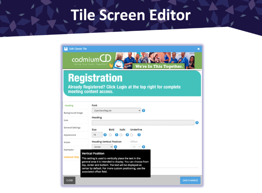
The tile screen was introduced a few months back and has become one of the most popular add-ons. Currently CadmiumCD employees create and edit the tile screen for you, but we’re building a tile screen editor so you can do this yourself just like you can in the eventScribe App main screen editor.
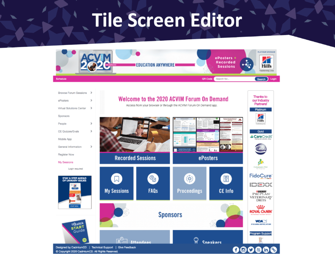
This feature is currently being developed and tested. It allows you to add images, icons and text to your tiles and control all kinds of settings related to how they look and work.
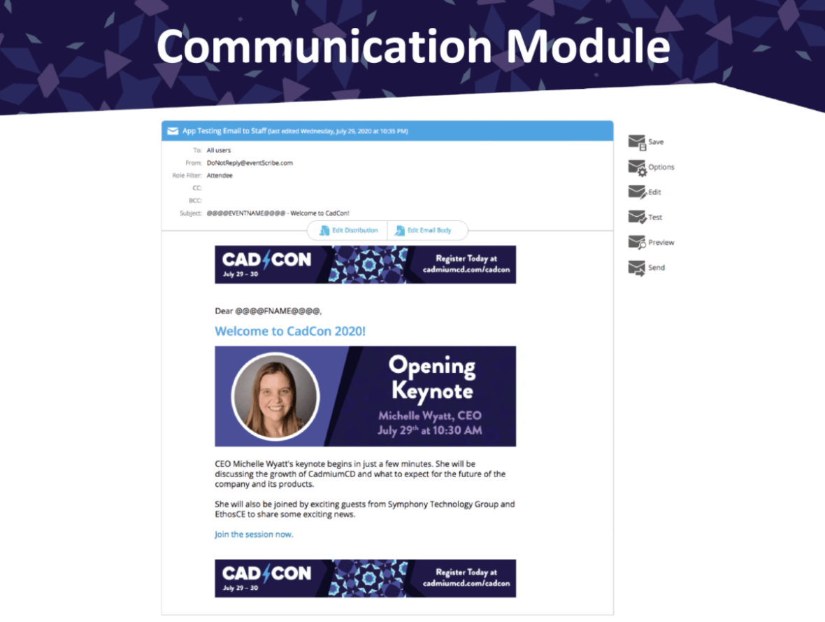
The website email module has been updated to the newest version that was already available for the app. As a part of the development for match making we’re planning to add new options to the email module to send more customized emails to attendees based on their engagement with content and match making preferences.
We’ll be updating the users page with more information, such as how complete the profile is and that highlights the elevator pitch data. We have also added a Test Account column that you can toggle on for yourself or colleagues looking at your website to get access to content buttons that are hidden for attendees until the event starts. These buttons will be highlighted in red on the popups so you know that you can only view them with your test account.
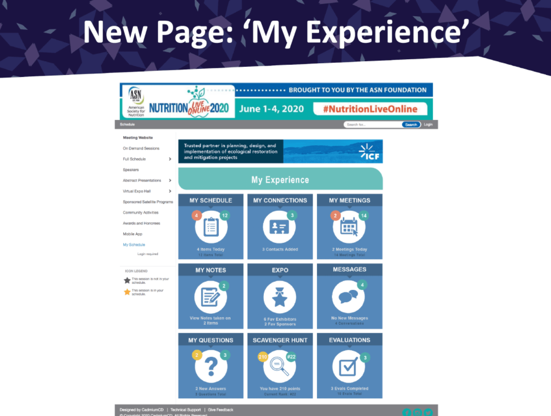
The new My Experience screen is a page that will be a much more detailed version of the My Schedule area that shows an attendee information that is specifically for them, such as their messages with attendees, notes, Scavenger Hunt progress and more. We’re expecting this to be one of the biggest features we’ll be launching at the end of this year.
We’ll be releasing a lot of new missions this fall for the Website and the Expo Harvester, some of them specific to some of your virtual event add-ons.
One of the first ones that was released was the Import Users Mission that gives you the freedom to add in your own eventScribe users.
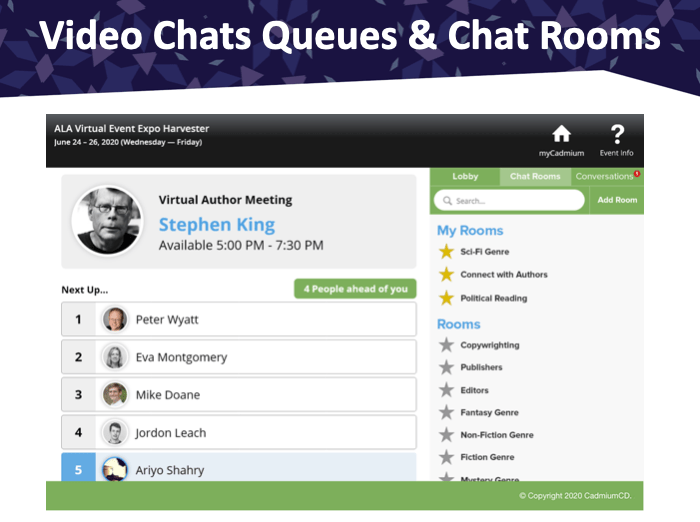
We will be exploring video chat queuing where you can have a one on one video chat with someone for a set amount of time before someone else comes in, such as for this example where you can meet an author.
To allow for more networking we want to facilitate one on one conversations between attendees, for example when waiting for a live stream to start in a virtual lobby.
This allows attendees to gradually trickle into a live stream instead of all coming in at once, which in cases where there is a login integration can be very taxing for your web services.
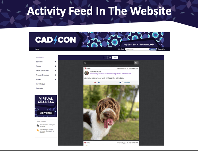
The Activity Feed data will become available in the website so that the content your attendees post can be viewed here as well.
Another way to view the Activity Feed will be on the Activity Feed Wall which shows all of the photos in a gallery, make it searchable and sharable.
Abstract Scorecard
The Review Site with a Mobile Responsive & Accessible Design
Reviewers will now be able to look through submissions on their phone and review them from there. They’re able to easily toggle between viewing the submission details and scoring the submission and move to a next one.
One of the hidden features of the Scorecard have been made easier to find, such as viewing other abstracts and presentation from the Education Harvester by a submitter throughout your events. This gives the reviewer more context about a submitter when looking at their submission.
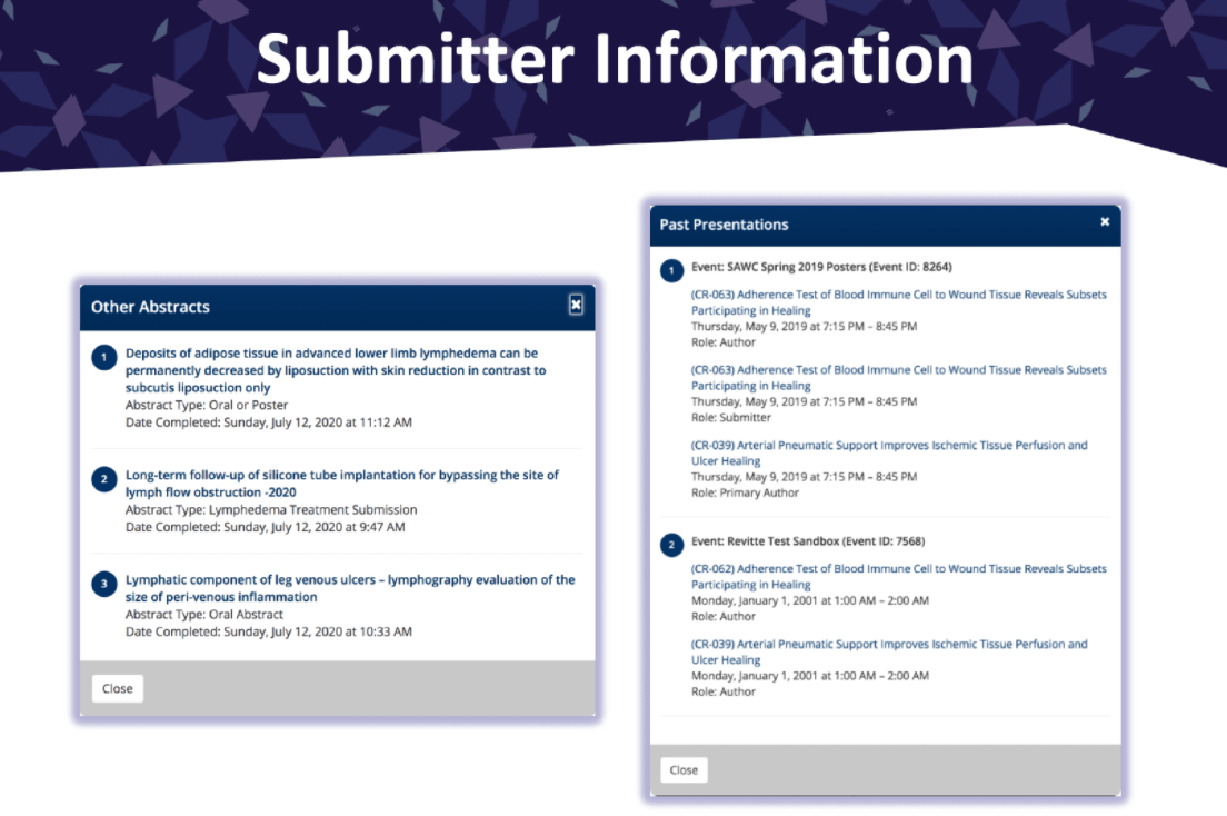
The reviewer experience on a desktop seems similar but it has gotten a lot of updates to make it more readable and much easier to use.
Both the submitter site and the review site are now accessible according to the WCAG 2.1 standard to make it accessible for the 25% of the country’s population who isn’t able to consume content as easily otherwise. Many of these changes aren’t visual, but help users with assistive technology such as screen readers. We’re currently working on getting certification for the accessible Scorecard review site.
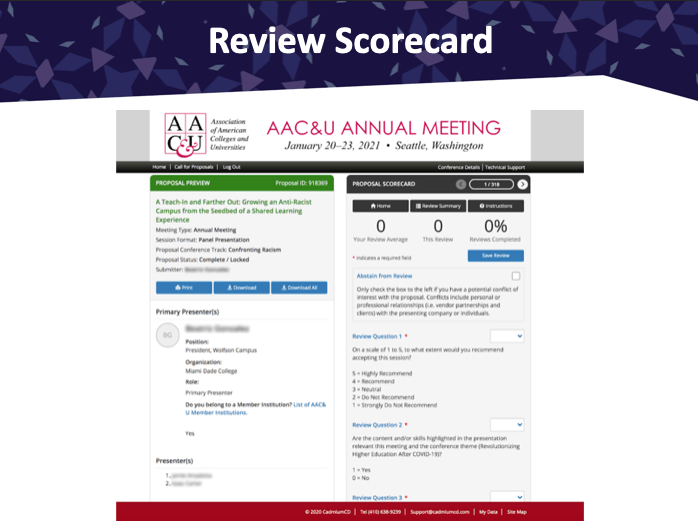
The Abstract Scorecard has different components such as the Review Scorecard which you all know. You can also use the Recommendation Scorecard, which was previously called the Chair Decision Worksheet that allows people to make final decisions based on reviews. With a pro Scorecard you can also use the Decision Scorecard and the Session Scorecard. It will be beta tested with a small group of clients before it will be launched to everyone in the fall. The new review site will be discussed in more detail in some upcoming webinars and in the next user group.
Want to Experience the Keynote First-Hand?
You can view a recording of CTO Peter Wyatt’s CadCon Keynote here. If you’d like to receive a demo of the platform, or learn more about any of the features mentioned in this article, let us know.